Identity for dr scientist
Branding design

About the project
Ambiance
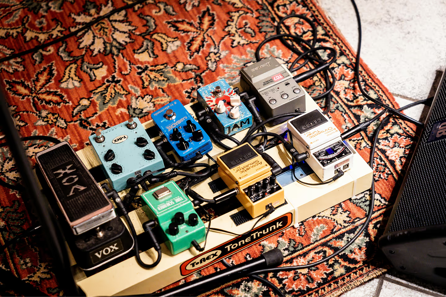
Dr Scientist is a company run my three people who make guitar pedals by hand.
Brief
The goal of this rebrand was to create a consistent brand identity that aligned with the company’s values, had potential to be expanded into something greater, and could be applied in different contexts.
Concept
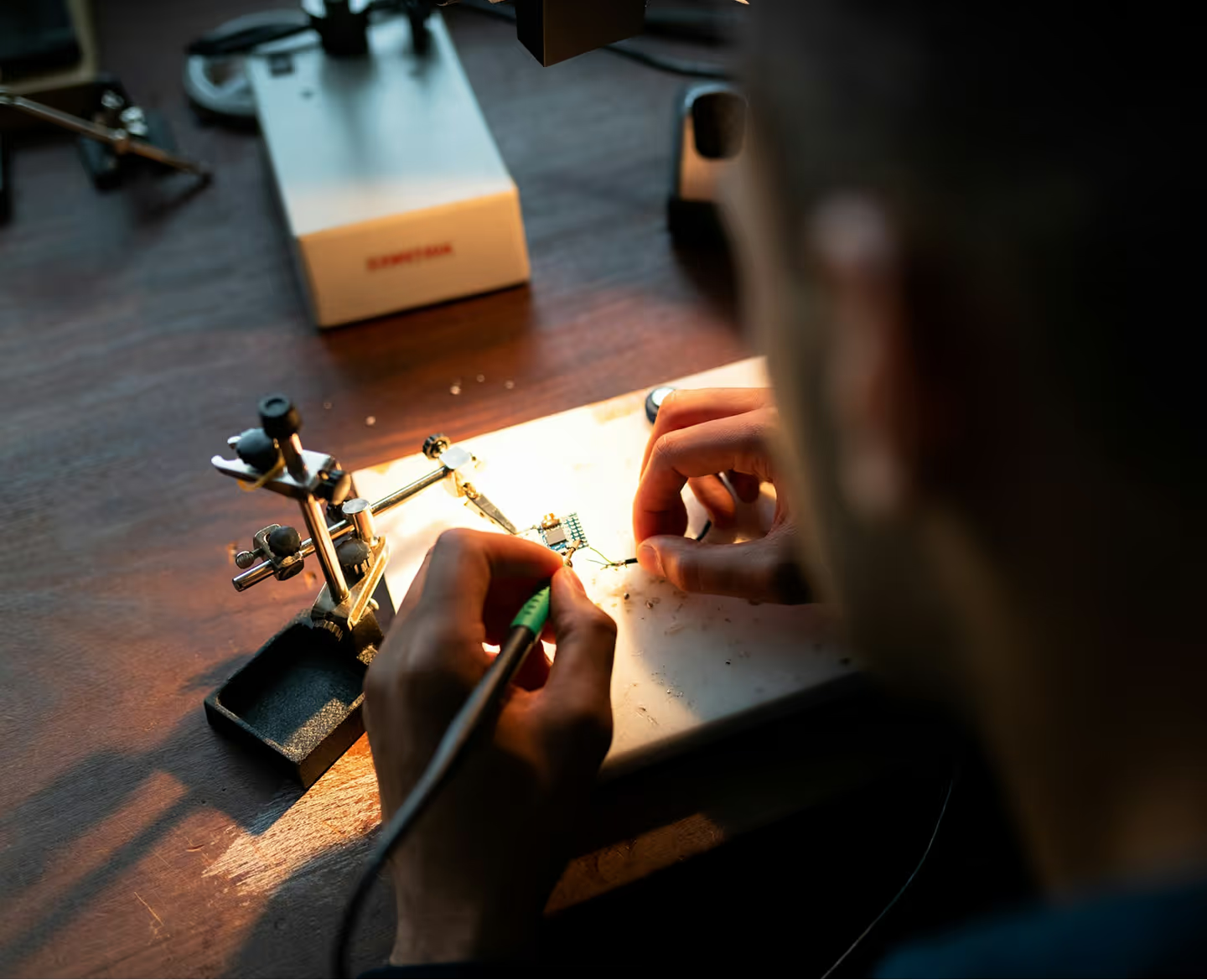
With no prior knowledge on guitar pedals and the craft, I made thorough research on the topic to better understand what I’m dealing with. I looked at the brand’s website and social media to understand their tone of voice and how they present themselves. I then did a lot of research on how guitar pedals are made and how they’re used to create music.
I knew that with this new branding I had to convey the playful language of the brand while also showing that, despite that, they make very high-quality products for people who are passionate about music.
Design process
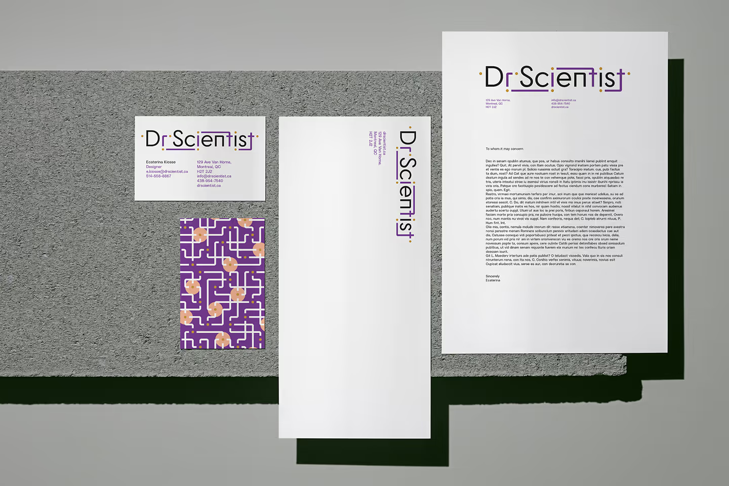
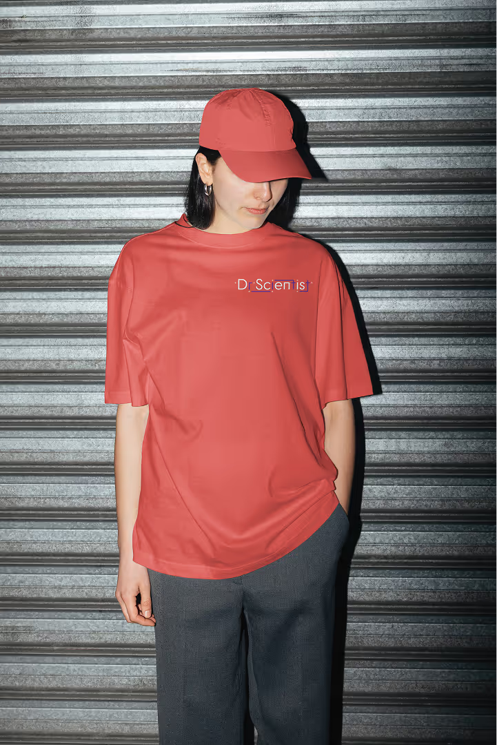
I quickly learned that with the musical nature of the product, I couldn’t make the identity fit into a specific style or genre. I decided to focus on the core element of every pedal: the circuit board. I made the name look like a circuit board by turning the letters into different components that can be found on one.
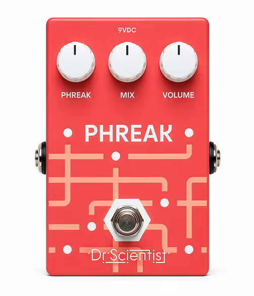
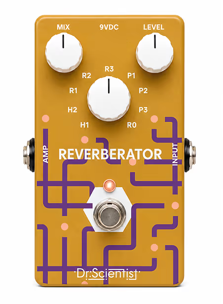
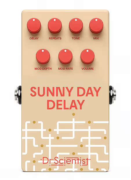
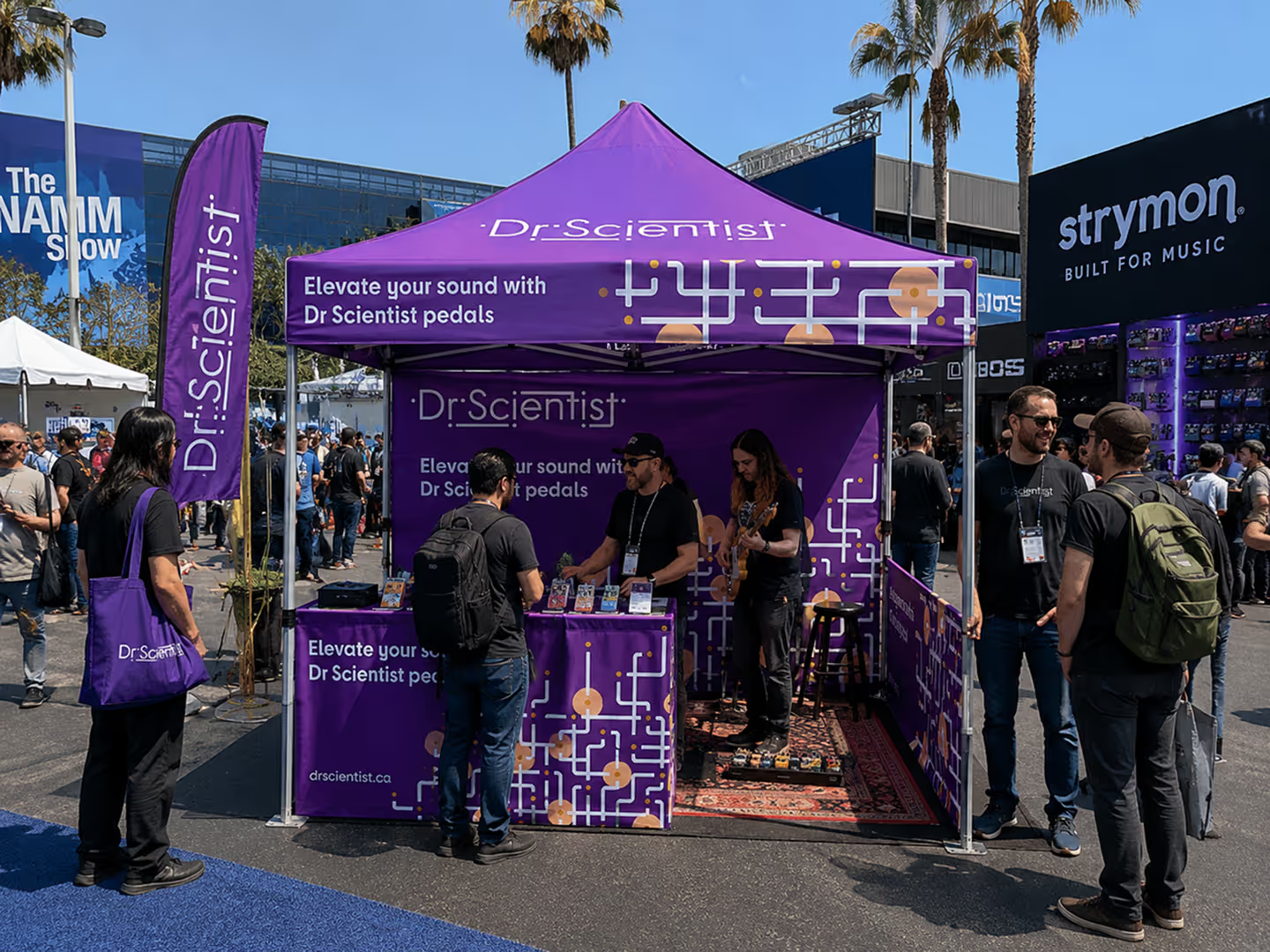
When I was working on the logo, I made sure to keep in mind how it could be applied in different contexts and what elements could potentially be used to expand the brand’s visual identity. I saw that the details of lines and dots would be great in creating a consistent brand identity across the different products.
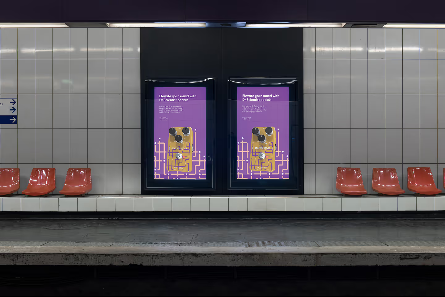
To have an idea of where those elements can be applied, I had to think on what direction this brand could potentially grow. I did research on what the target audience of this brand might be interested in, as well as what events and activities they might attend.
Dr Scientist is a company run my three people who make guitar pedals by hand.
brief
The goal of this rebrand was to create a consistent brand identity that aligned with the company’s values, had potential to be expanded into something greater, and could be applied in different contexts.

With no prior knowledge on guitar pedals and the craft, I made thorough research on the topic to better understand what I’m dealing with. I looked at the brand’s website and social media to understand their tone of voice and how they present themselves. I then did a lot of research on how guitar pedals are made and how they’re used to create music.
I knew that with this new branding I had to convey the playful language of the brand while also showing that, despite that, they make very high-quality products for people who are passionate about music.
Design process
I quickly learned that with the musical nature of the product, I couldn’t make the identity fit into a specific style or genre. I decided to focus on the core element of every pedal: the circuit board. I made the name look like a circuit board by turning the letters into different components that can be found on one.
Design process
When I was working on the logo, I made sure to keep in mind how it could be applied in different contexts and what elements could potentially be used to expand the brand’s visual identity. I saw that the details of lines and dots would be great in creating a consistent brand identity across the different products.

Design process
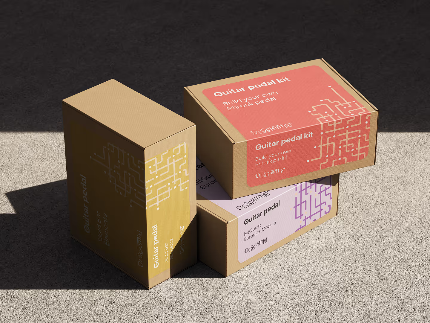
To have an idea of where those elements can be applied, I had to think on what direction this brand could potentially grow. I did research on what the target audience of this brand might be interested in, as well as what events and activities they might attend.





Credits
Mockups
Mockup Maison, Mockups Design, ChatGPT
Typefaces
Cy by supertype. Object Sans by Pangram Pangram