Wayfinding for Montreal en Lumiere
Information design

About the project
Ambiance
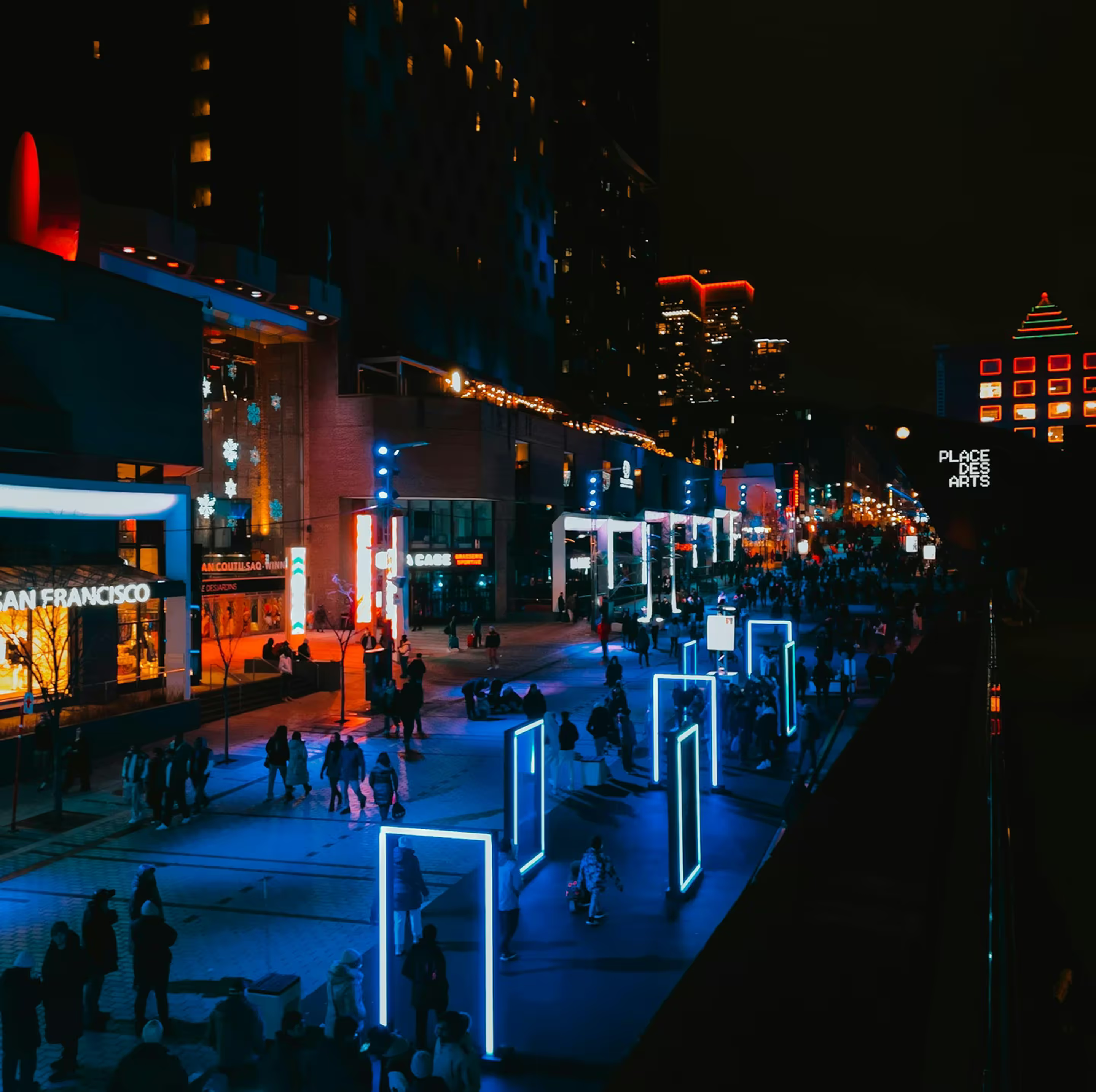
Montréal en Lumière is a festival in Montreal for people to get together and try out new food prepared by local chefs and spend time together as a family in the different attractions. It is an event that has activities located in different areas of Place des Arts.
Brief
I was asked to create an outdoor wayfinding system for the festival to guide users and help them navigate the festival grounds. I had to make sure that the panels and their location enhanced the visitor experience and made it more user-friendly.
Concept
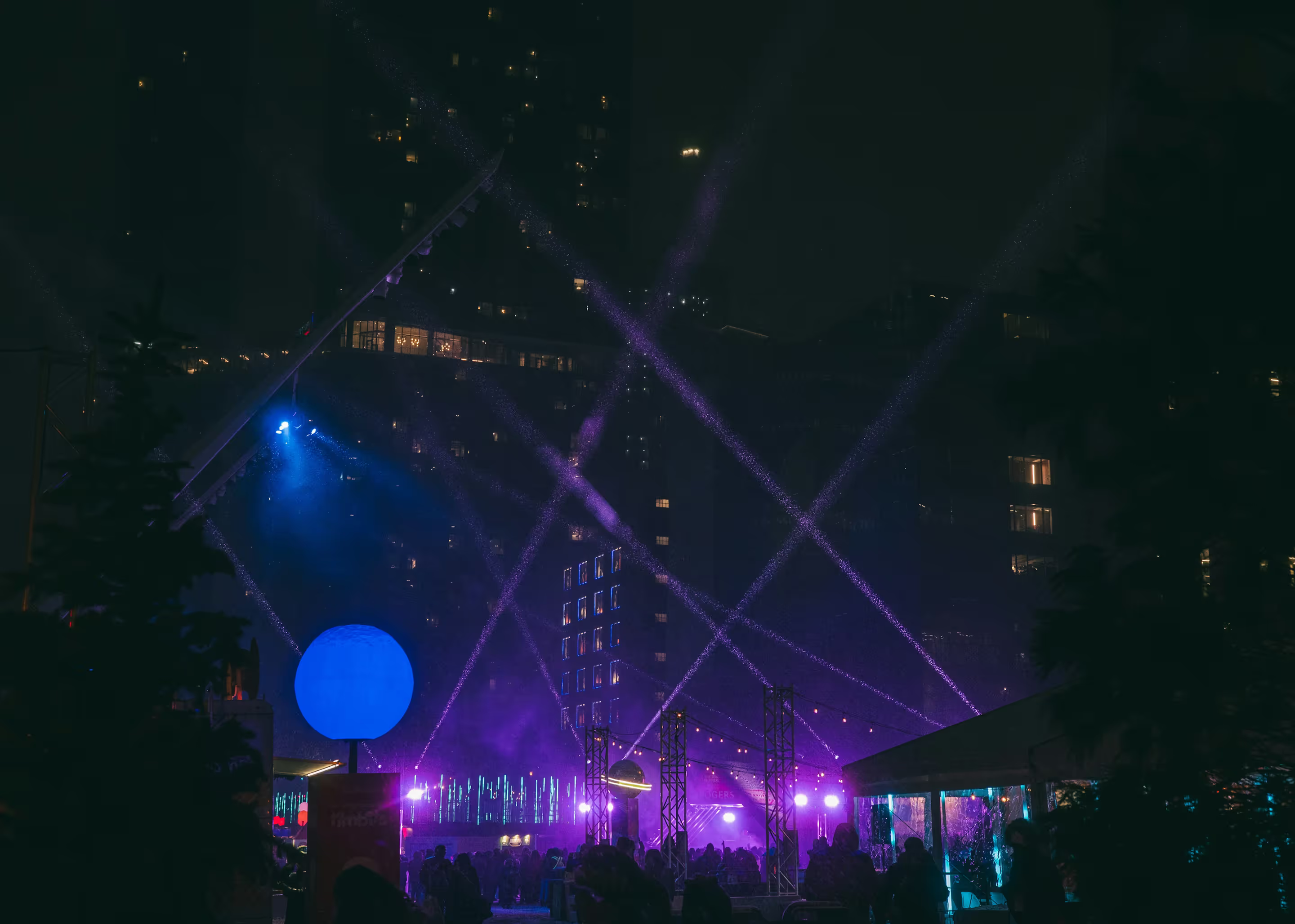
Having attended the festival a couple of times, I decided to revisit the location to refresh my memory and see the different locations where I could potentially put signage. The festival takes place at night, has a lot of interesting light sculptures, and is always bustling with people. I wanted my signage to belong and work well with the environment of the festival without making it blend in too much with the sculptures.
Because the festival was created around food culture, I chose for the contrast in food’s different textures to be my inspiration. The keyword “contrast” was guiding the decisions for the design choices, such as the material, the typography, and icon design.
Design process
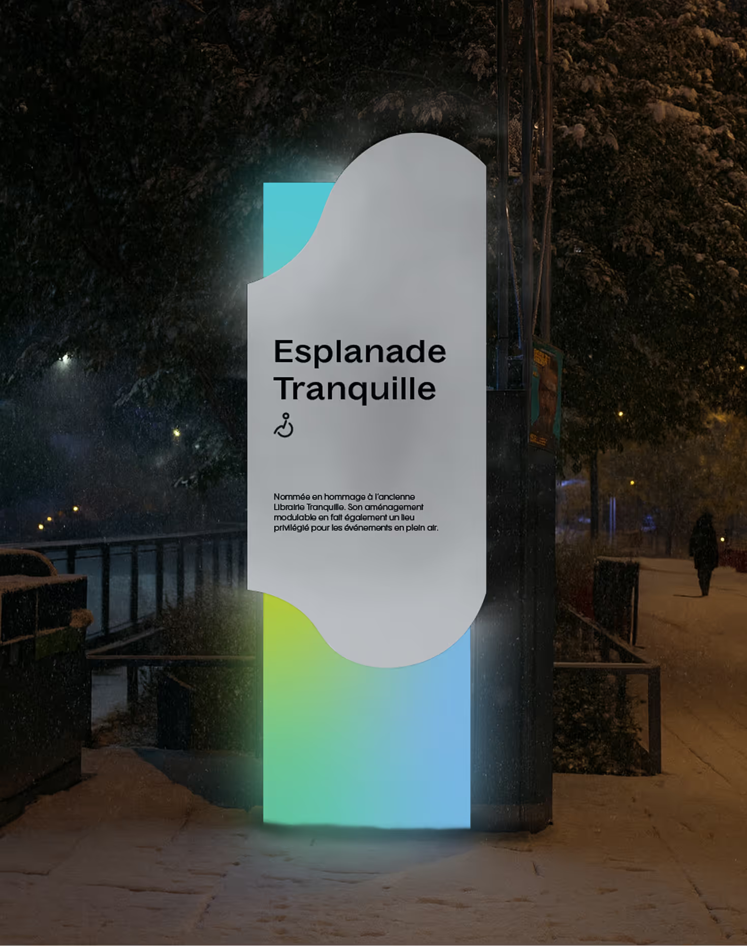
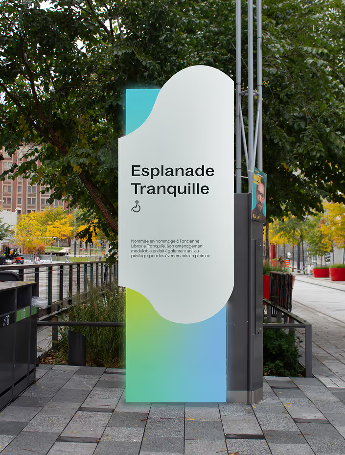
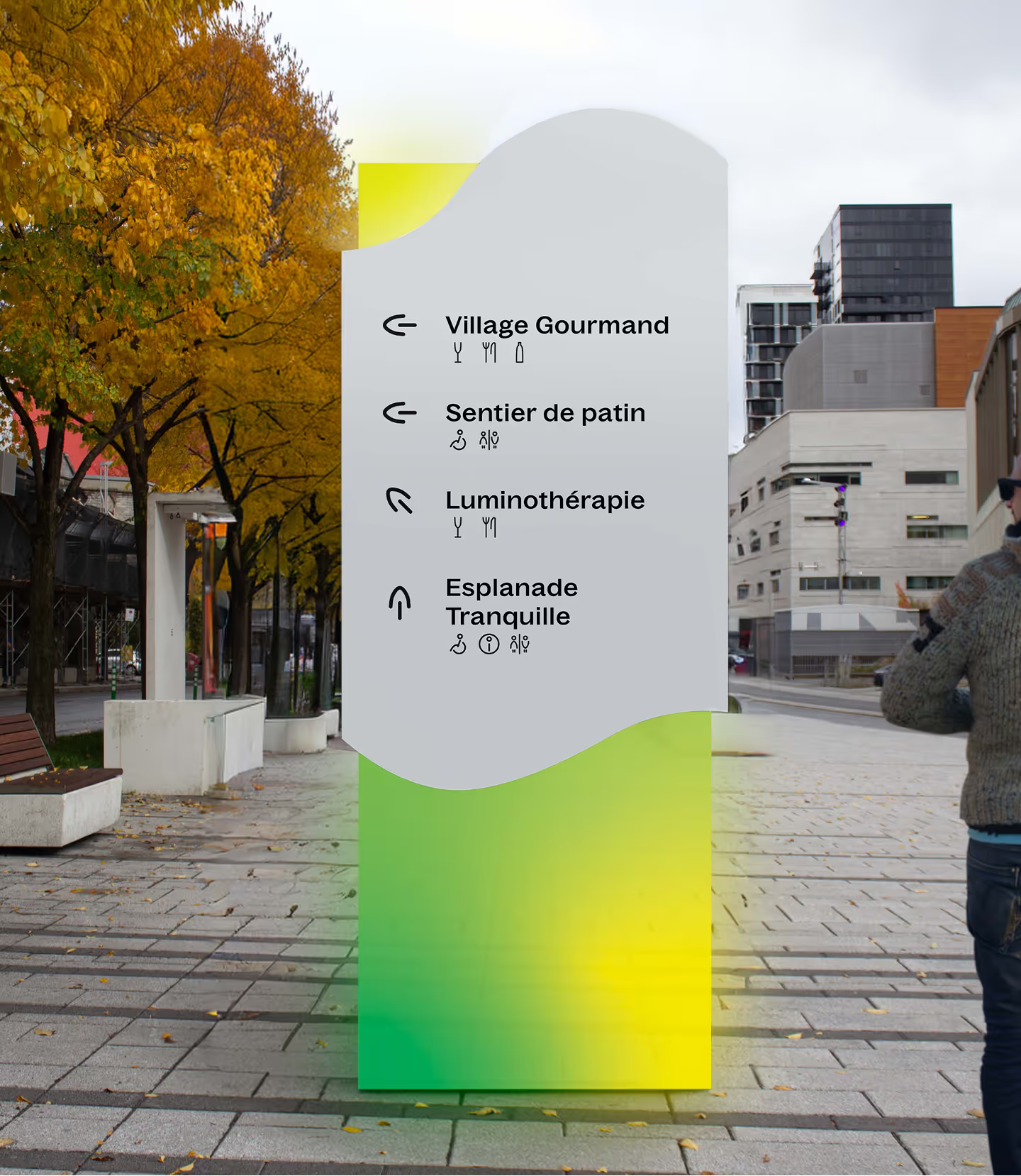
Because the festival takes place at night, I knew that my panel would need to be visible in low light. I achieved this by incorporating light into my panel by using edge-lit lighting with acrylic and putting the information on a light material—aluminum—to make it legible in dimmer settings.
Because the festival takes place at night, I knew that my panel would need to be visible in low light. I achieved this by incorporating light into my panel by using edge-lit lighting with acrylic and putting the information on a light material—aluminum—to make it legible in dimmer settings.
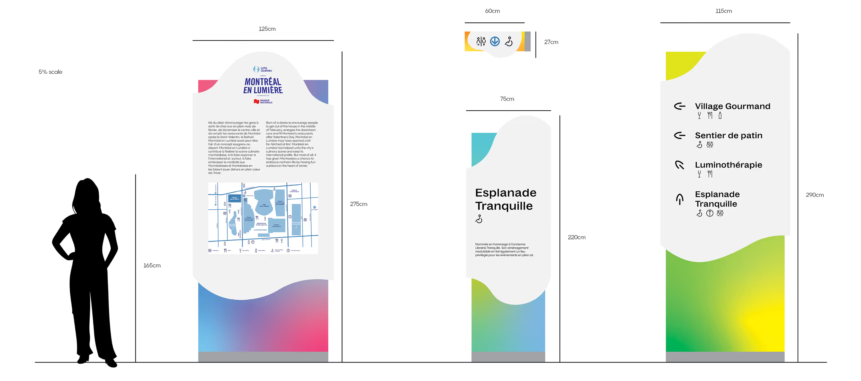
I created consistency across the different panels with the grid used to organize the information on the panel and by creating a consistent color system.
I brought this element of sharp and organic into my pictograms. I created a curved shape that conveyed that and used it across my different pictograms. This created consistency across the different elements in my family.
Ambiance
Montréal en Lumière is a festival in Montreal for people to get together and try out new food prepared by local chefs and spend time together as a family in the different attractions. It is an event that has activities located in different areas of Place des Arts.
Brief
I was asked to create an outdoor wayfinding system for the festival to guide users and help them navigate the festival grounds. I had to make sure that the panels and their location enhanced the visitor experience and made it more user-friendly.
Concept
Having attended the festival a couple of times, I decided to revisit the location to refresh my memory and see the different locations where I could potentially put signage. The festival takes place at night, has a lot of interesting light sculptures, and is always bustling with people. I wanted my signage to belong and work well with the environment of the festival without making it blend in too much with the sculptures.
Because the festival was created around food culture, I chose for the contrast in food’s different textures to be my inspiration. The keyword “contrast” was guiding the decisions for the design choices, such as the material, the typography, and icon design.

Design process
Because the festival takes place at night, I knew that my panel would need to be visible in low light. I achieved this by incorporating light into my panel by using edge-lit lighting with acrylic and putting the information on a light material—aluminum—to make it legible in dimmer settings.
Text titles
Because the festival takes place at night, I knew that my panel would need to be visible in low light. I achieved this by incorporating light into my panel by using edge-lit lighting with acrylic and putting the information on a light material—aluminum—to make it legible in dimmer settings.

Text titles
I created consistency across the different panels with the grid used to organize the information on the panel and by creating a consistent color system.
I brought this element of sharp and organic into my pictograms. I created a curved shape that conveyed that and used it across my different pictograms. This created consistency across the different elements in my family.

Credits
Tyepefaces
Bagoss by Displaay, Pangram Sans by Pangram Pangram