Cookbook on Fermentation and Food preservation
Publication design
About the project
Ambiance
Food preservation is an extension of cooking that has been around for thousands of years around the world. It is still done today in households and found in store shelves.
Brief
My mission was to create a book on different ways of preserving food around the world and present the information in an interesting and welcoming way. I was tasked with taking the historical and cultural aspect of the topic and adapting it to my target audience of young adults and people who want to explore more ways of transforming food in the kitchen.
Concept
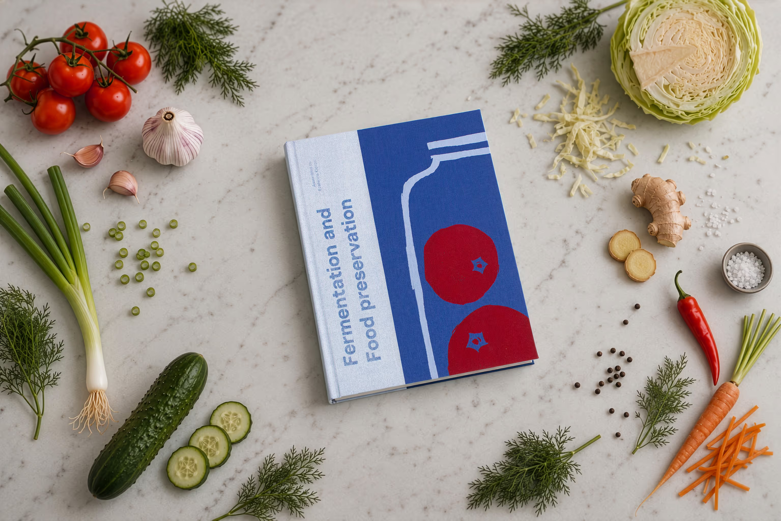
To get more familiar with the topic and recipes, I went to the Ferment Fest to see what is possible with food preservation. I saw a very big variety of products and talked to the different people running the stalls. The atmosphere of the event felt very warm, fun, exciting, and most importantly welcoming.
I wanted to bring the energy of the community in my book through the color choice, typography, photography, and illustrations.
Design process
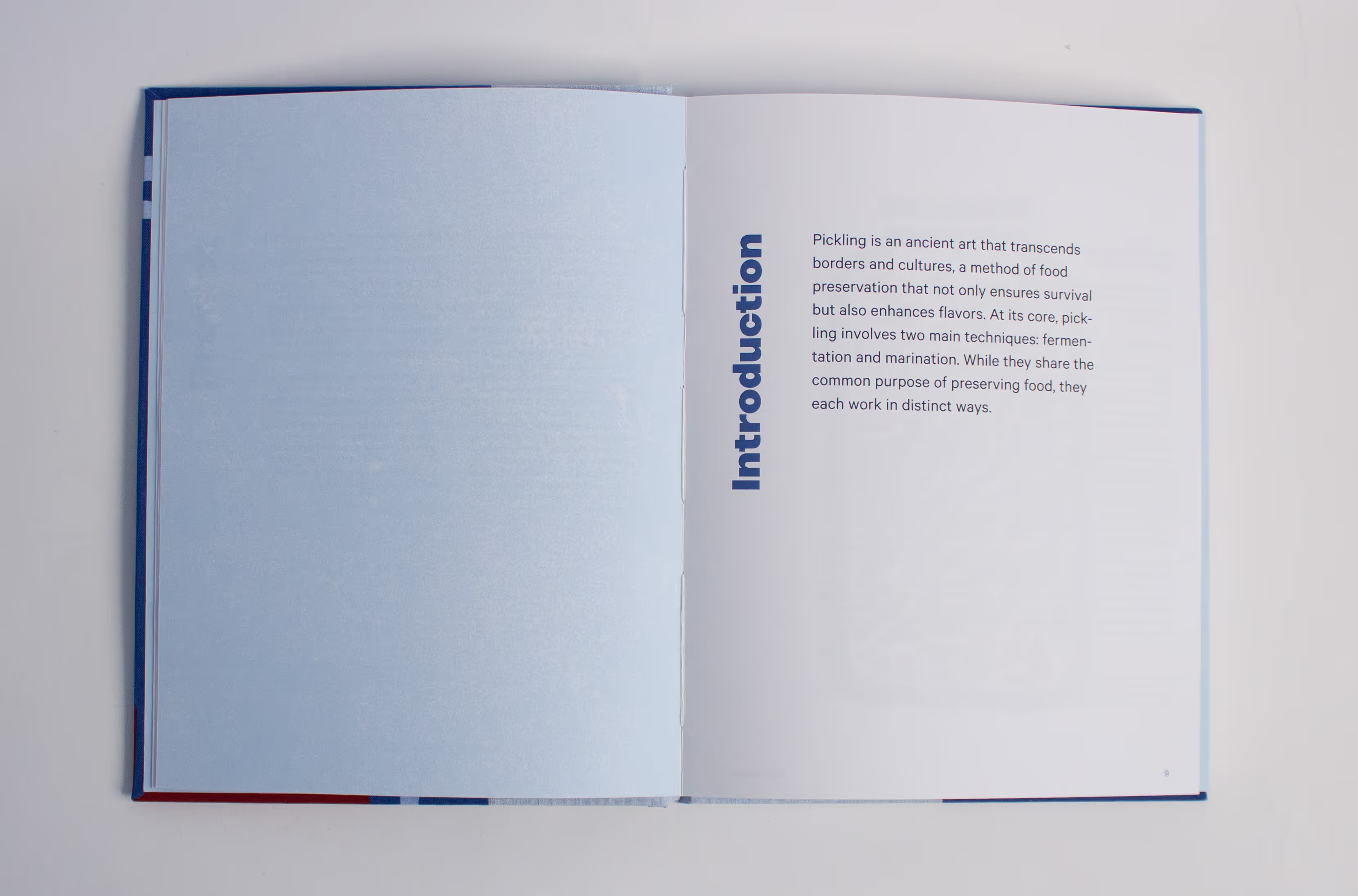
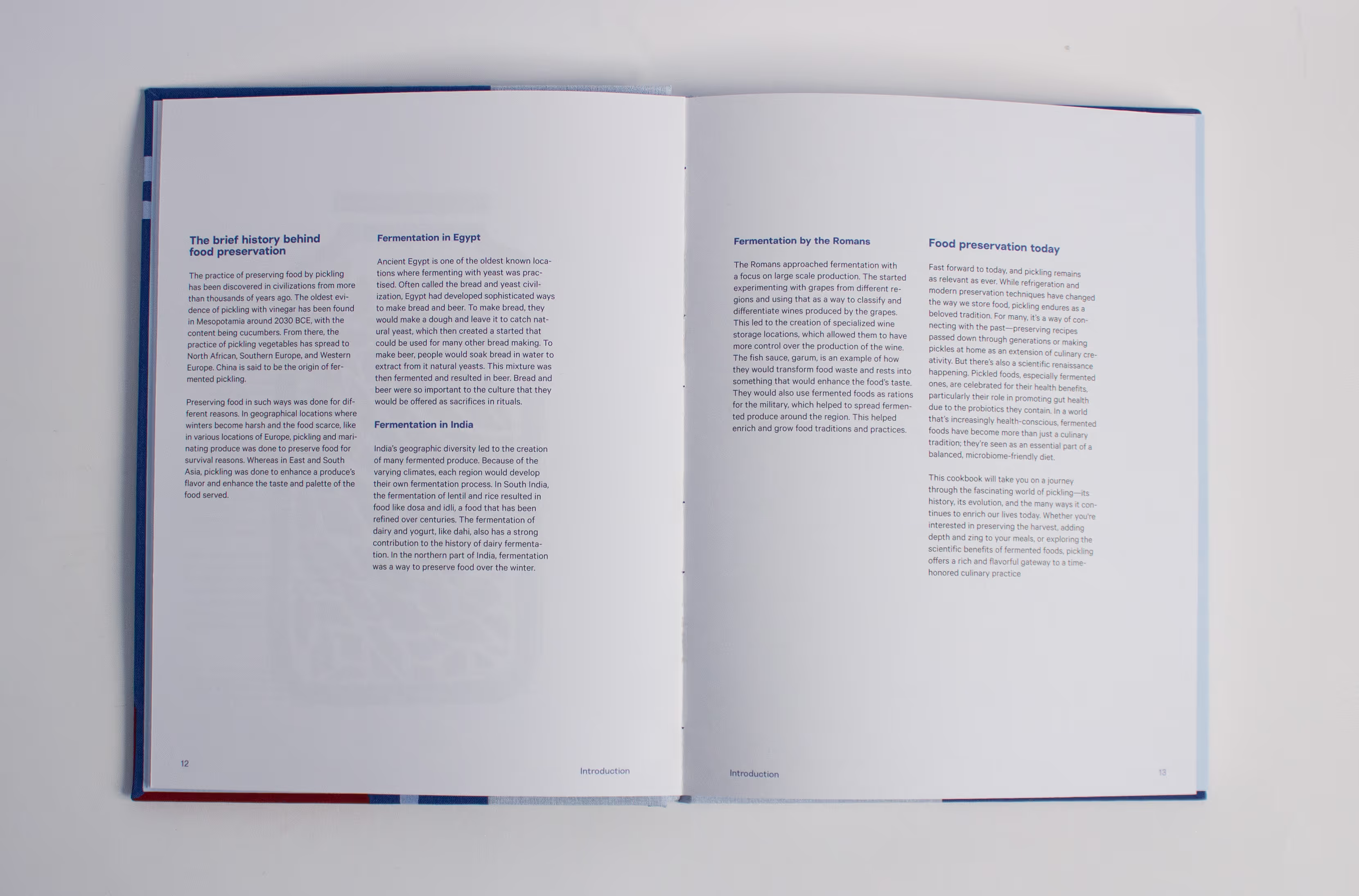
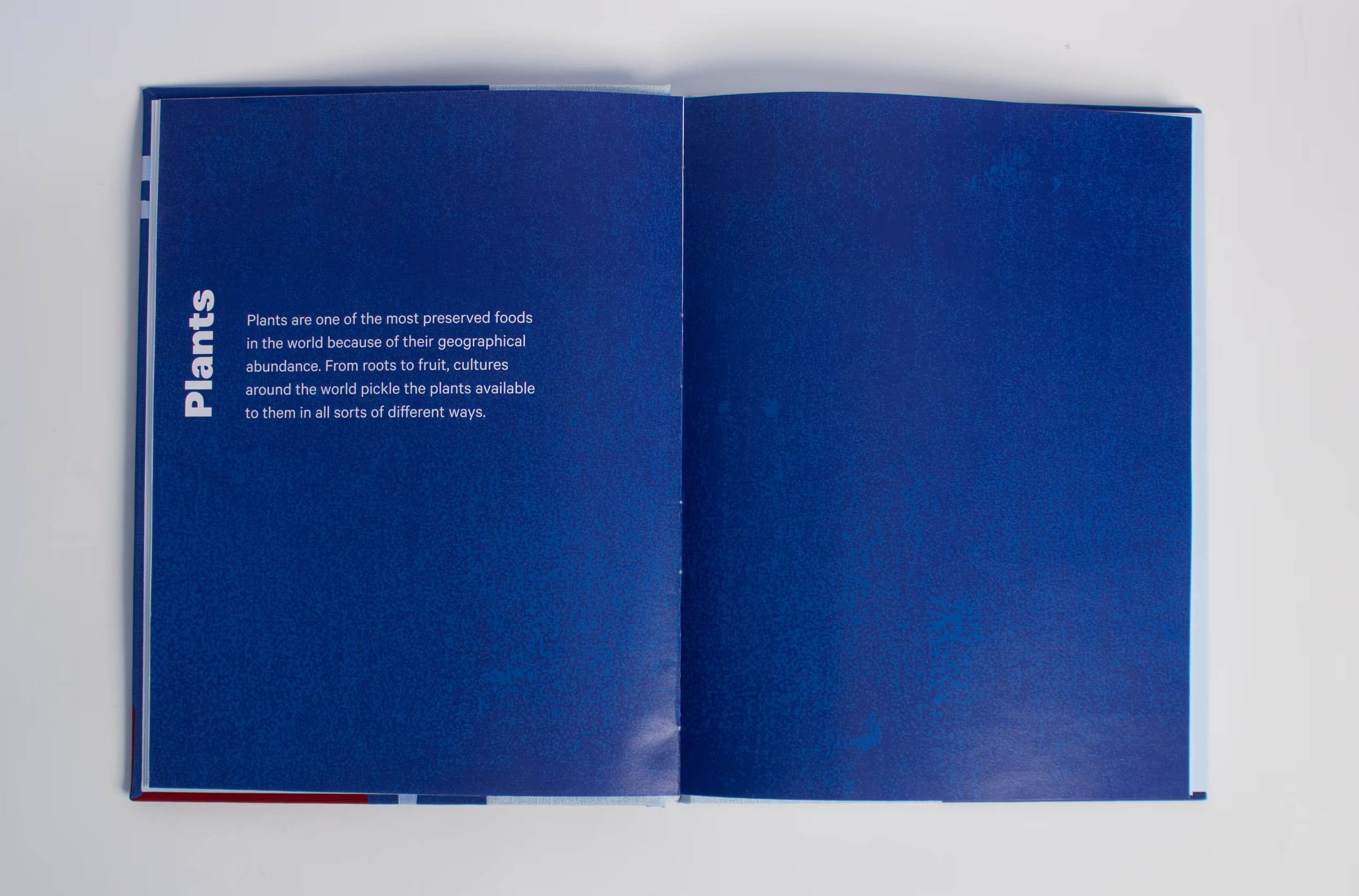
I managed to make the layout of the information and recipes clear, interesting, and welcoming while keeping it structured. I achieved this by making my titles break from the horizontal flow of the page and making them vertical. This design element makes the layout more dynamic, fun, and playful. This makes it a lot easier for the cook to find the information and recipe that they’re looking for because they can see the name when flipping through the pages.
I brought the artisanal aspect to the book by making the book myself. Instead of outsourcing the book, I learned a craft that I have never done before. This process required a lot of effort and care and created an amazing result.
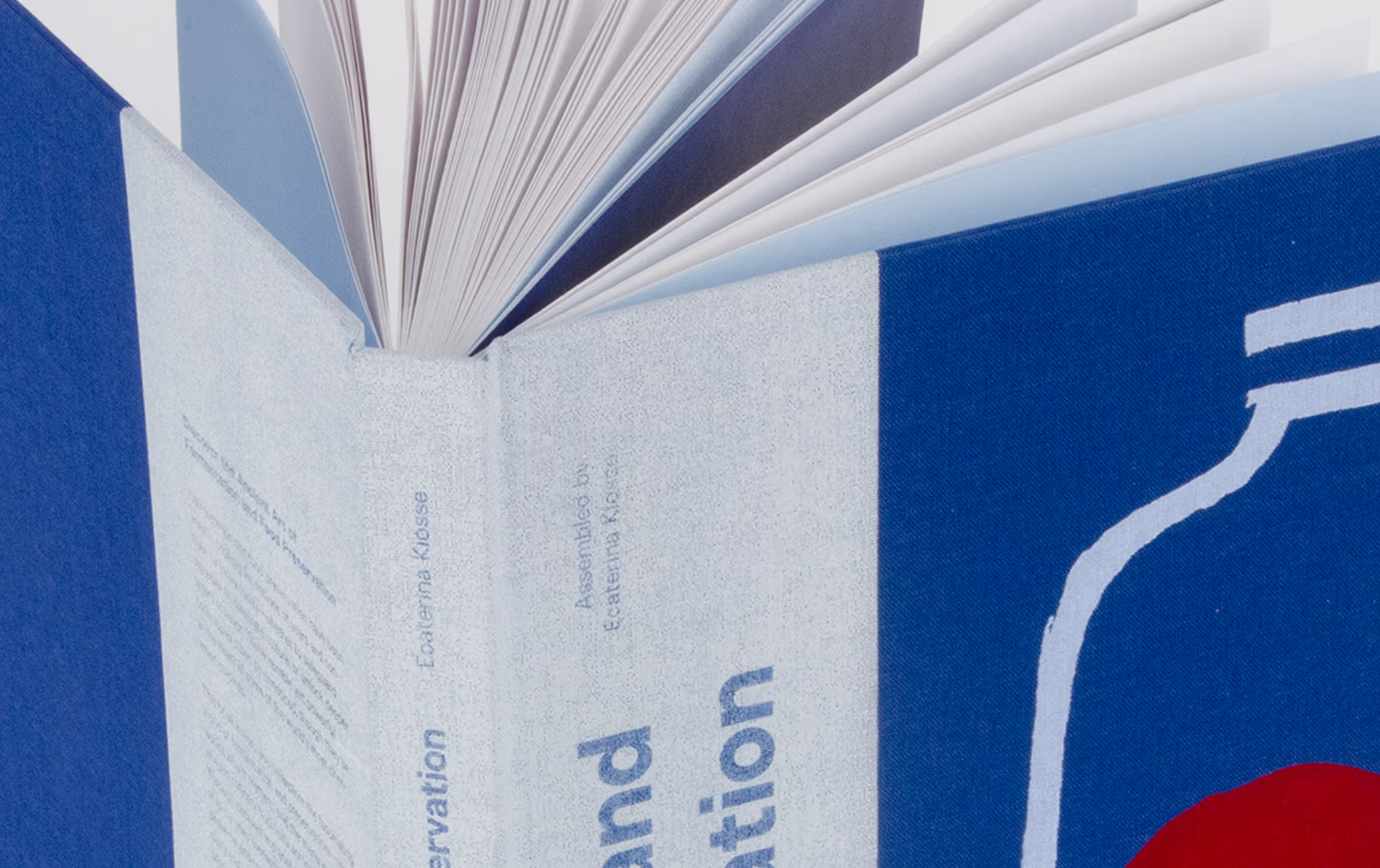
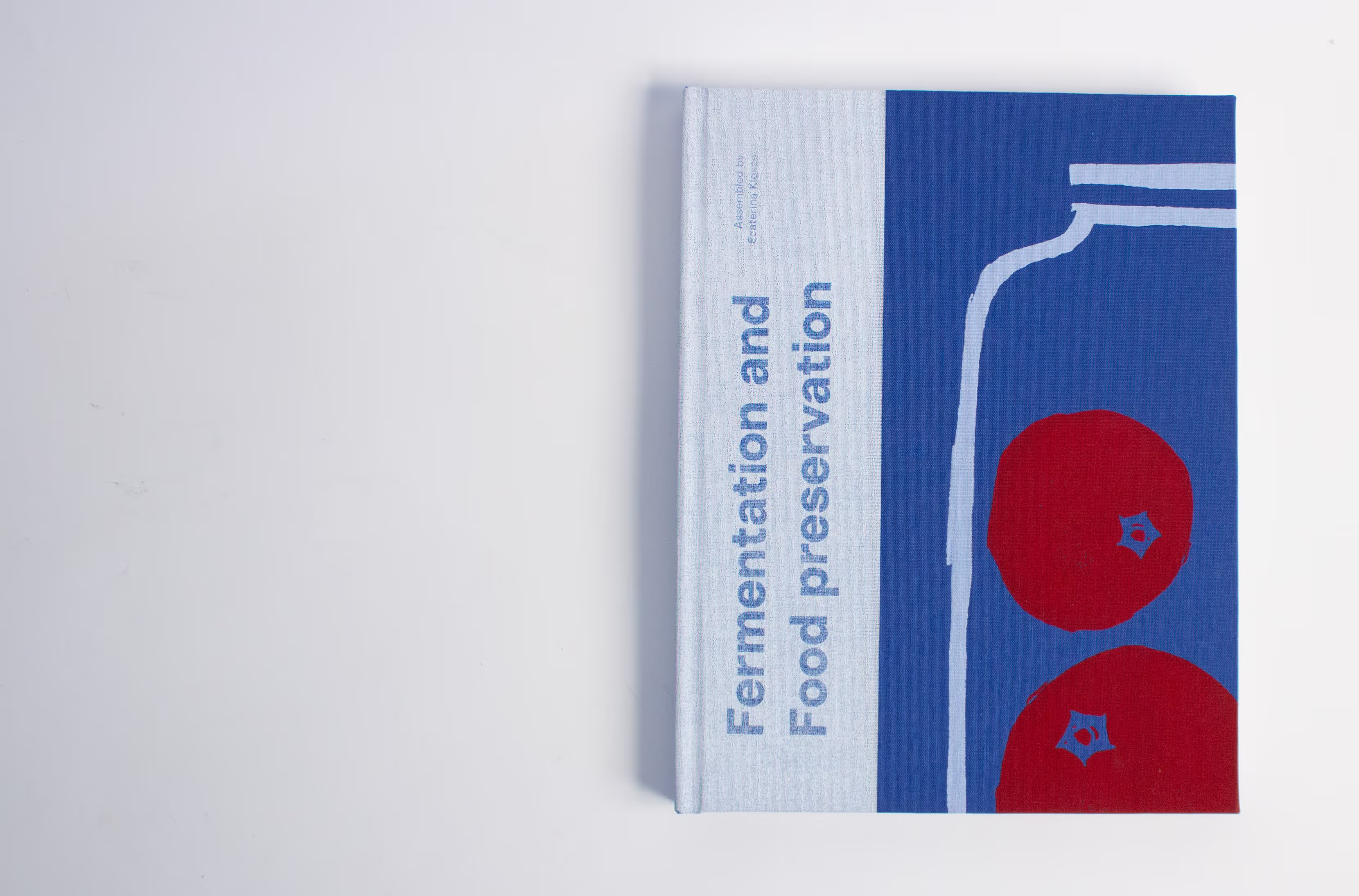
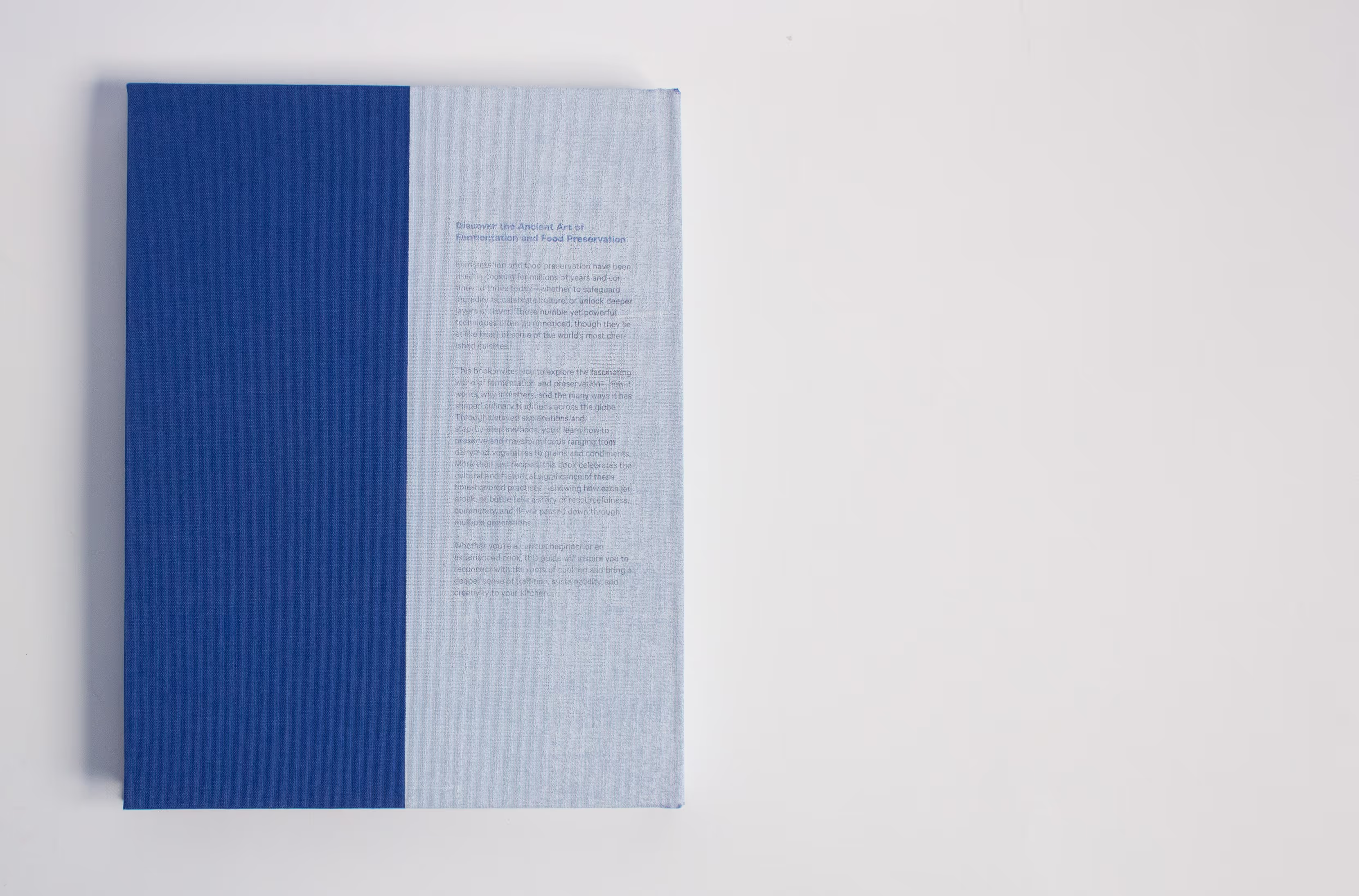
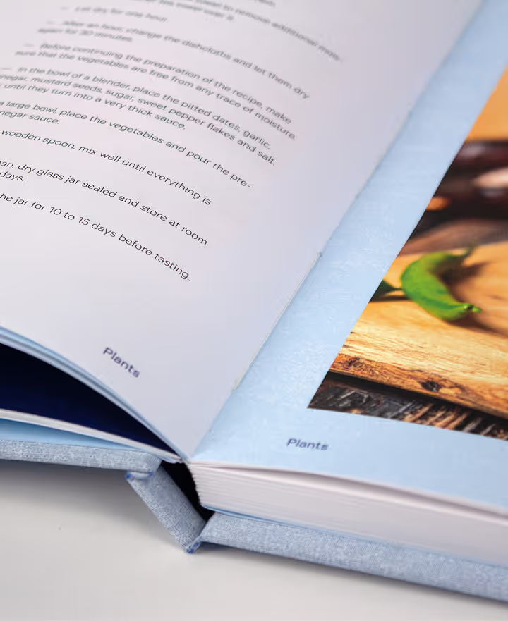
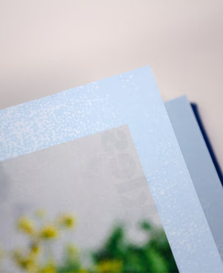
Through this process, I got to incorporate materials and techniques that made my project even better and stronger. I chose to use a beautiful blue book cloth with a very nice texture. I added graphic elements and area for text by screen printing the elements and printed the text on top of the screen-printed area. This process is unique and special: to replicate its results, the texture and ink techniques would require different materials and production techniques.
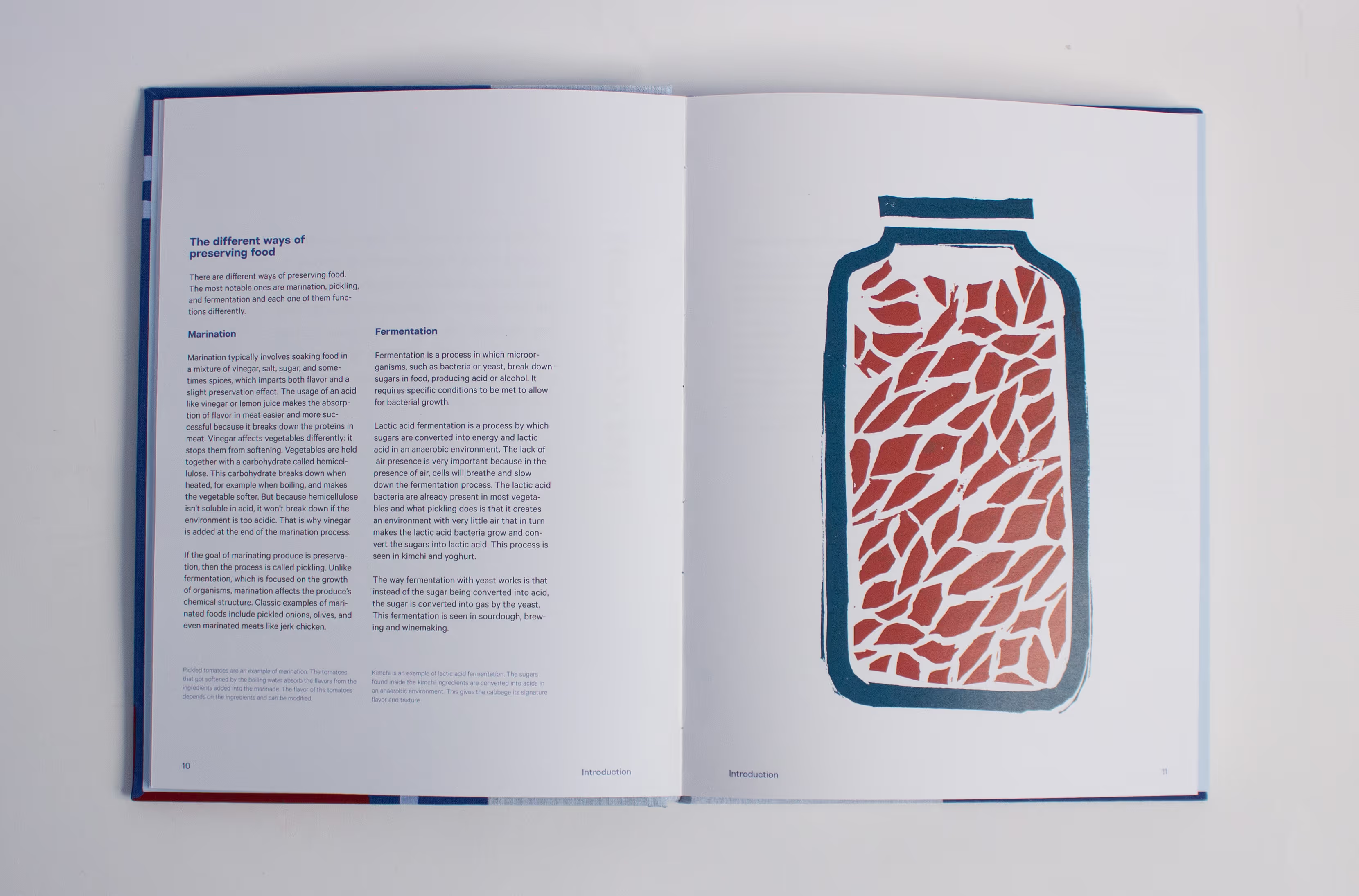
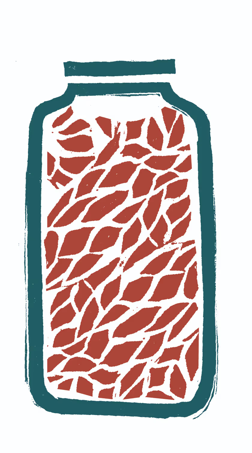
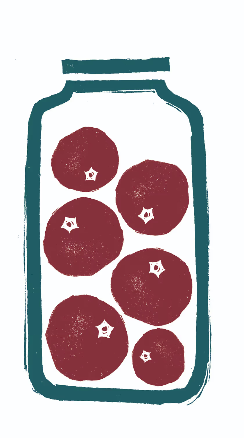
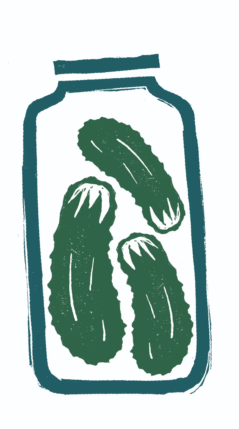
Because of the artisanal nature of fermentation, making illustrations with lino cut enhances the artisanal feeling and adds texture to the book. I also used the textures in the background of the images accompanying the recipes.
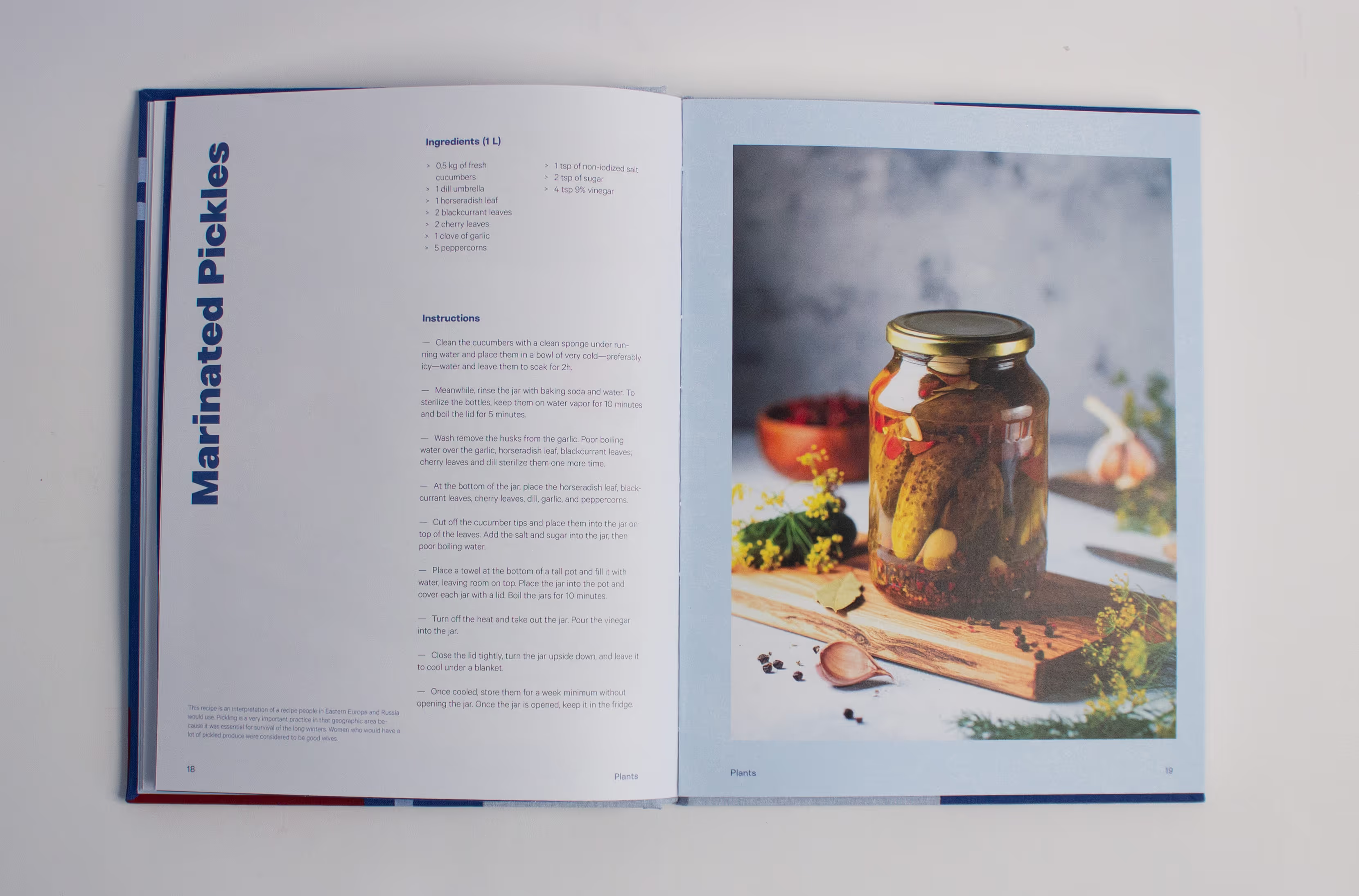
The structure of the recipe page is arranged in a clear way that makes it easy to find the information. The different ways the ingredients and instructions are presented helps distinguish them very easily. The choice of colour and its subtle presence throughout the book makes the layout feel softer and more welcoming.
Ambiance
Food preservation is an extension of cooking that has been around for thousands of years around the world. It is still done today in households and found in store shelves.

Brief
My mission was to create a book on different ways of preserving food around the world and present the information in an interesting and welcoming way. I was tasked with taking the historical and cultural aspect of the topic and adapting it to my target audience of young adults and people who want to explore more ways of transforming food in the kitchen.
Concept
To get more familiar with the topic and recipes, I went to the Ferment Fest to see what is possible with food preservation. I saw a very big variety of products and talked to the different people running the stalls. The atmosphere of the event felt very warm, fun, exciting, and most importantly welcoming.
I wanted to bring the energy of the community in my book through the color choice, typography, photography, and illustrations.

Design process
I managed to make the layout of the information and recipes clear, interesting, and welcoming while keeping it structured. I achieved this by making my titles break from the horizontal flow of the page and making them vertical. This design element makes the layout more dynamic, fun, and playful. This makes it a lot easier for the cook to find the information and recipe that they’re looking for because they can see the name when flipping through the pages.
Text titles
I brought the artisanal aspect to the book by making the book myself. Instead of outsourcing the book, I learned a craft that I have never done before. This process required a lot of effort and care and created an amazing result.
Through this process, I got to incorporate materials and techniques that made my project even better and stronger. I chose to use a beautiful blue book cloth with a very nice texture. I added graphic elements and area for text by screen printing the elements and printed the text on top of the screen-printed area. This process is unique and special: to replicate its results, the texture and ink techniques would require different materials and production techniques.
Text titles
Because of the artisanal nature of fermentation, making illustrations with lino cut enhances the artisanal feeling and adds texture to the book. I also used the textures in the background of the images accompanying the recipes.
Text titles
The structure of the recipe page is arranged in a clear way that makes it easy to find the information. The different ways the ingredients and instructions are presented helps distinguish them very easily. The choice of colour and its subtle presence throughout the book makes the layout feel softer and more welcoming.

Credits
Typefaces
Linear Sans by Gradient Type, Calibre by Klim Type Foundry