Soap for Marchés Publics de Montréal
Packaging design

About the project
Ambiance
Marchés Publics de Montréal (MPM) is a local, nonprofit organization representing several public markets that aims to make local produce accessible to the people of Montreal.
Brief
I was asked to create the packaging of a product found at the MPM markets that is made of locally sourced ingredients and to create a line extension for it. The product is high quality soaps catered to different skin types: normal, sensitive, and dry. The target audience for the product are environmentally conscious and care about the origin of the products and their ingredients.
Concept
I first went to visit the MPM markets and to see what products they have and how they look. I noticed that compared to the amount of food products, there are very little wellness products. Because of Canada’s varying weather conditions, many people’s skin can suffer from the climate. This shows the importance of having good quality soaps available for the consumers.
I wanted to give the consumer a good experience and make them feel confident that the product will cater to their skin’s need by highlighting the product’s quality, bringing a sense of relaxation, and creating an interesting tactile experience.
Design process
Because of the tactile nature of the product, I chose to play around with contrast in textures. A good contrast to the smooth soap was thicker paper with its fibrous nature. The usage of paper allowed for the technique of embossing, enhancing the tactility of the project.
I made a lot of embossing tests to find the different textures and patterns that would accompany well the skin types.
The combination of minimalism and white space with the embossing and texture created a feeling of elegance and really highlighted the high-quality aspect of the soap.
I also enhanced the experience of opening the product by adding typography that creates an ambiance and by placing it in different places on the packaging.
The shape of the packaging allows it to be displayed in an interesting way on store shelves.
Ambiance
Marchés Publics de Montréal (MPM) is a local, nonprofit organization representing several public markets that aims to make local produce accessible to the people of Montreal.

Brief
I was asked to create the packaging of a product found at the MPM markets that is made of locally sourced ingredients and to create a line extension for it. The product is high quality soaps catered to different skin types: normal, sensitive, and dry. The target audience for the product are environmentally conscious and care about the origin of the products and their ingredients.
Peau Sensible
Fleurs sauvages
Peau Normale
Cèdre agrume et sauge
Peau Sèche
Gruau, lavande et lait de chèvre
Concept
I first went to visit the MPM markets and to see what products they have and how they look. I noticed that compared to the amount of food products, there are very little wellness products. Because of Canada’s varying weather conditions, many people’s skin can suffer from the climate. This shows the importance of having good quality soaps available for the consumers.
I wanted to give the consumer a good experience and make them feel confident that the product will cater to their skin’s need by highlighting the product’s quality, bringing a sense of relaxation, and creating an interesting tactile experience.

Design process
Because of the tactile nature of the product, I chose to play around with contrast in textures. A good contrast to the smooth soap was thicker paper with its fibrous nature. The usage of paper allowed for the technique of embossing, enhancing the tactility of the project.
I made a lot of embossing tests to find the different textures and patterns that would accompany well the skin types.
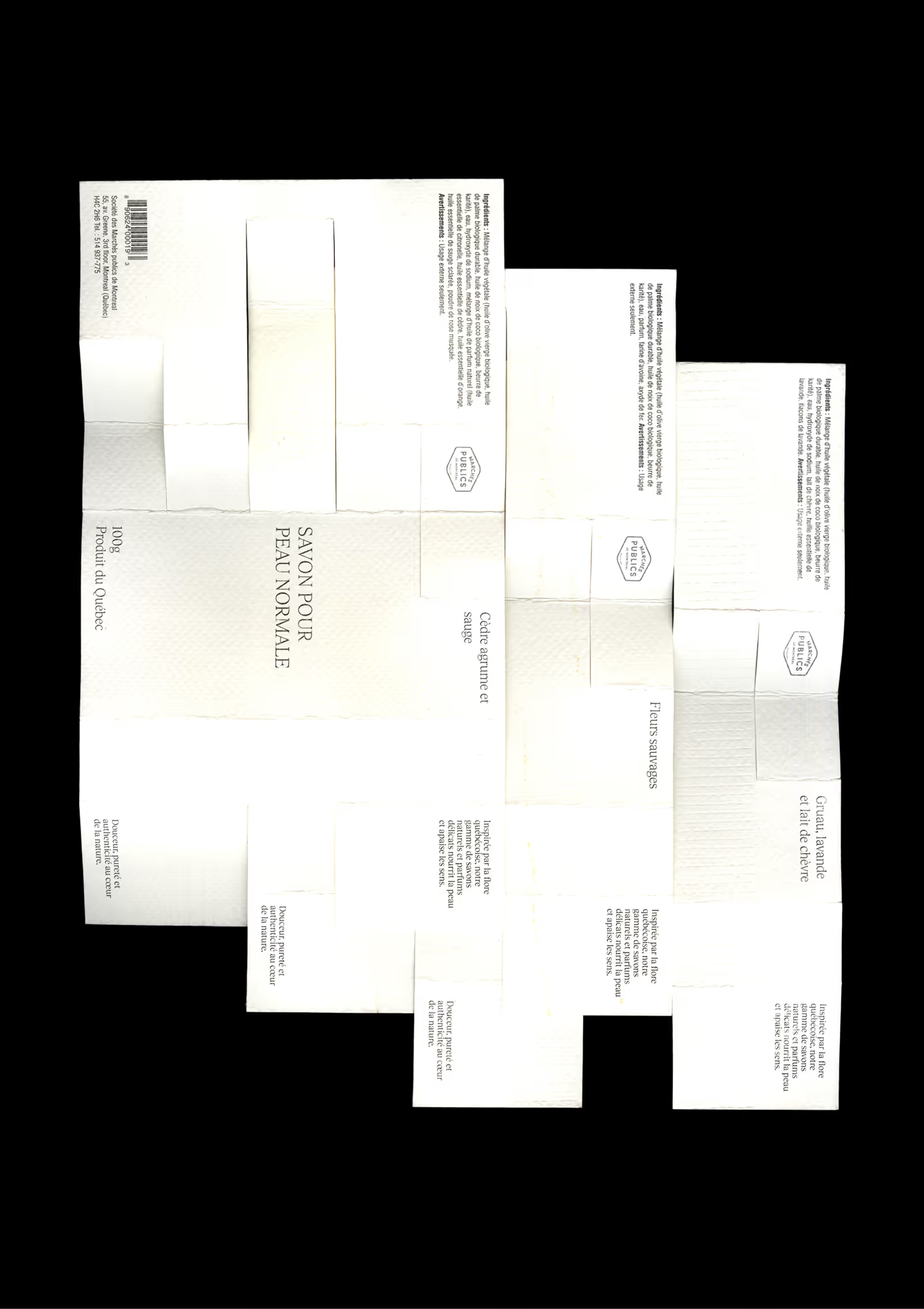
Text titles
The combination of minimalism and white space with the embossing and texture created a feeling of elegance and really highlighted the high-quality aspect of the soap.
I also enhanced the experience of opening the product by adding typography that creates an ambiance and by placing it in different places on the packaging.
The shape of the packaging allows it to be displayed in an interesting way on store shelves.


Credits
Photographer
Kayleigh Lord
Typefaces
Tobias by Letters from Sweden