Publication on the history of video games
Publication design
About the project
Ambiance
Video Game: A Short Story is a booklet on the chronological history of video games and their development over the decades.
Brief
I was tasked with designing an informative and descriptive layout that accompanies well the content. The booklet needed to be interesting to anyone curious about video games.
Concept
After reading the text provided, I started looking for themes that are consistent across the whole book. As someone who has some basic knowledge of video games, I asked my friends who know more about the topic to read the provided text. Having them read it helped me get a better understanding of the topic and find interesting information about the subject.
A theme we agreed to be interesting was the change in sizes of the video game devices and how the creation of new technology is done by building on top of things that already existed before. I incorporated those themes into my design through the visuals, layout composition, and choice of paper.
Design process
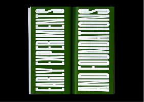
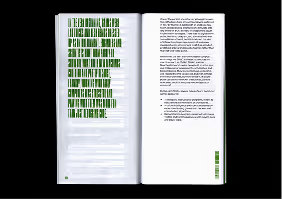
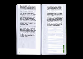
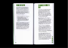
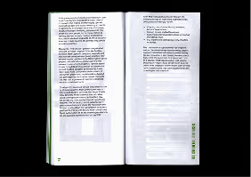
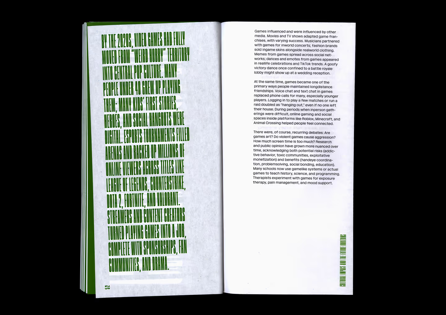
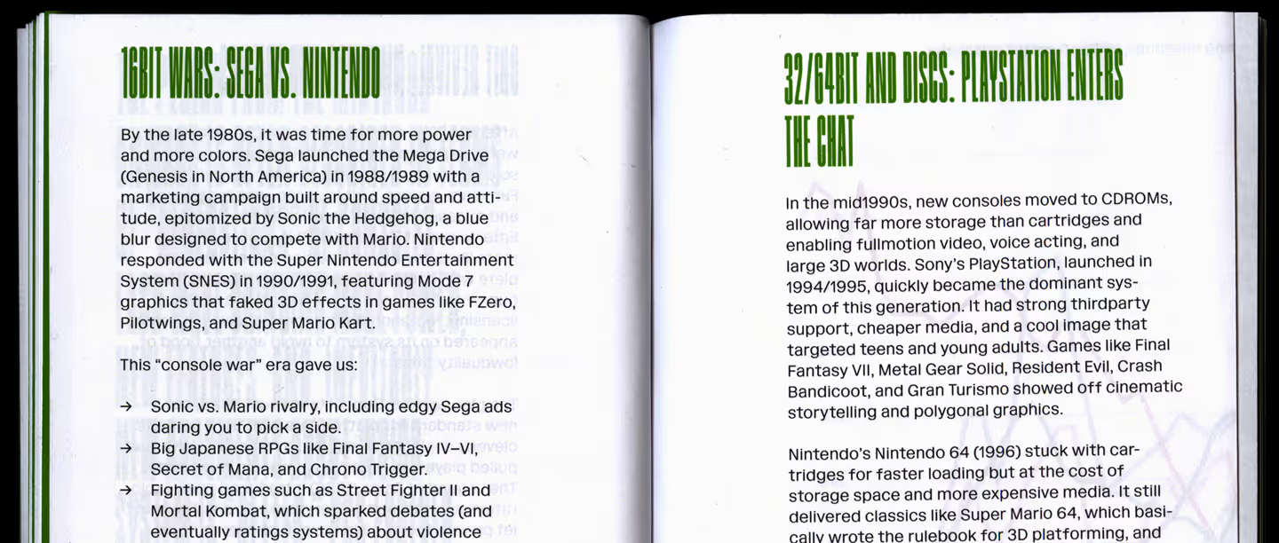
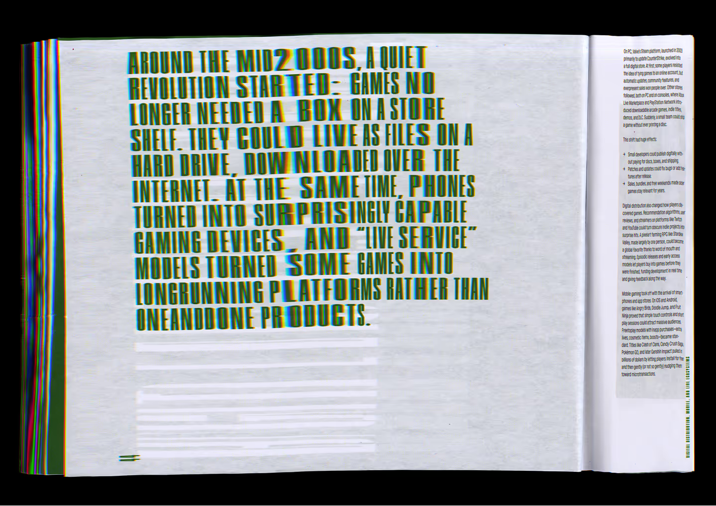
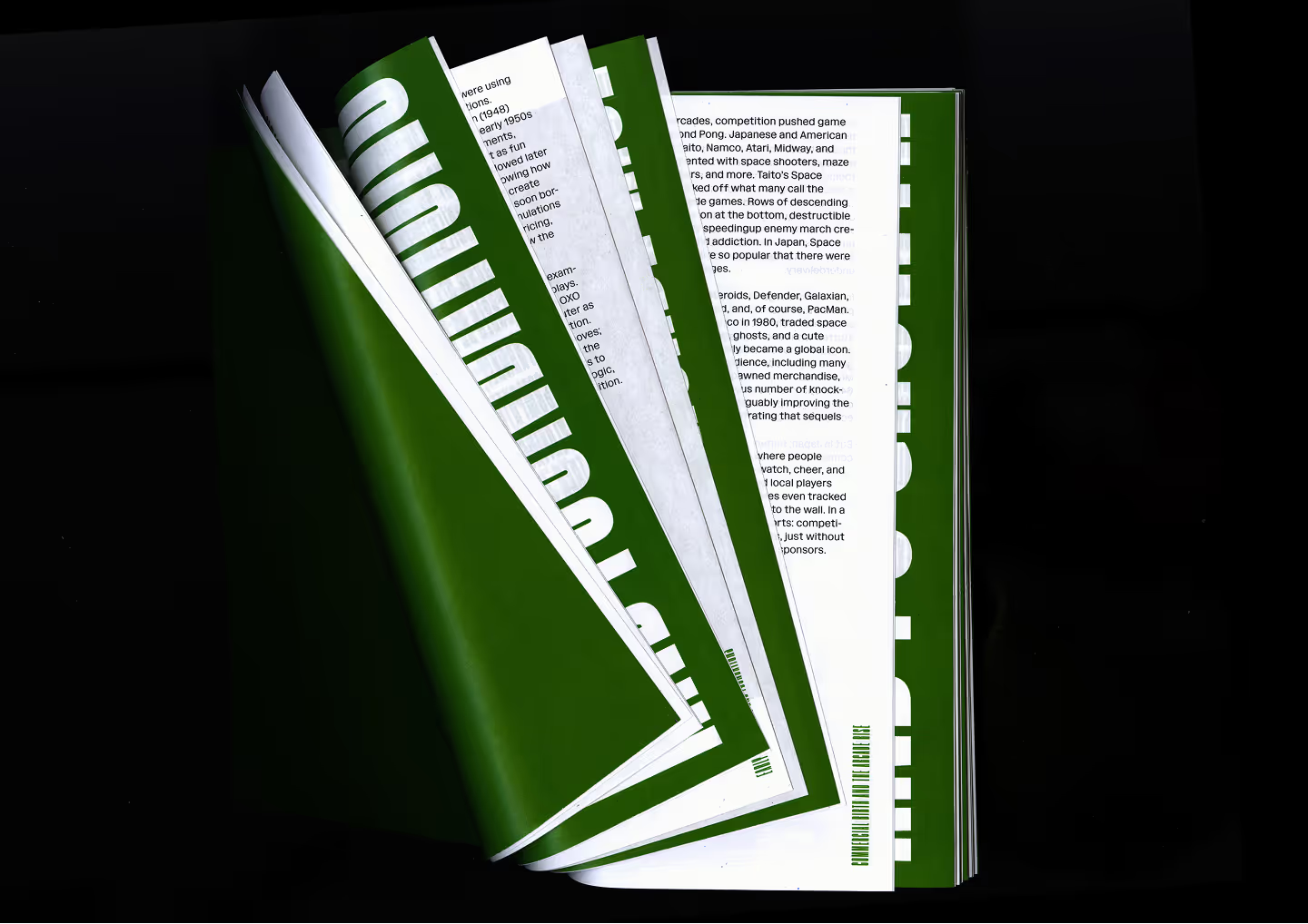
To present the decreasing size of devices in an interesting way, I decided to play around with typographic compositions to show how in the past they were very big and how now they are small enough to fit in our pockets. I wanted to use typography to create interesting visual texture in different parts of the layouts like the section openers and the first paragraph of each section.
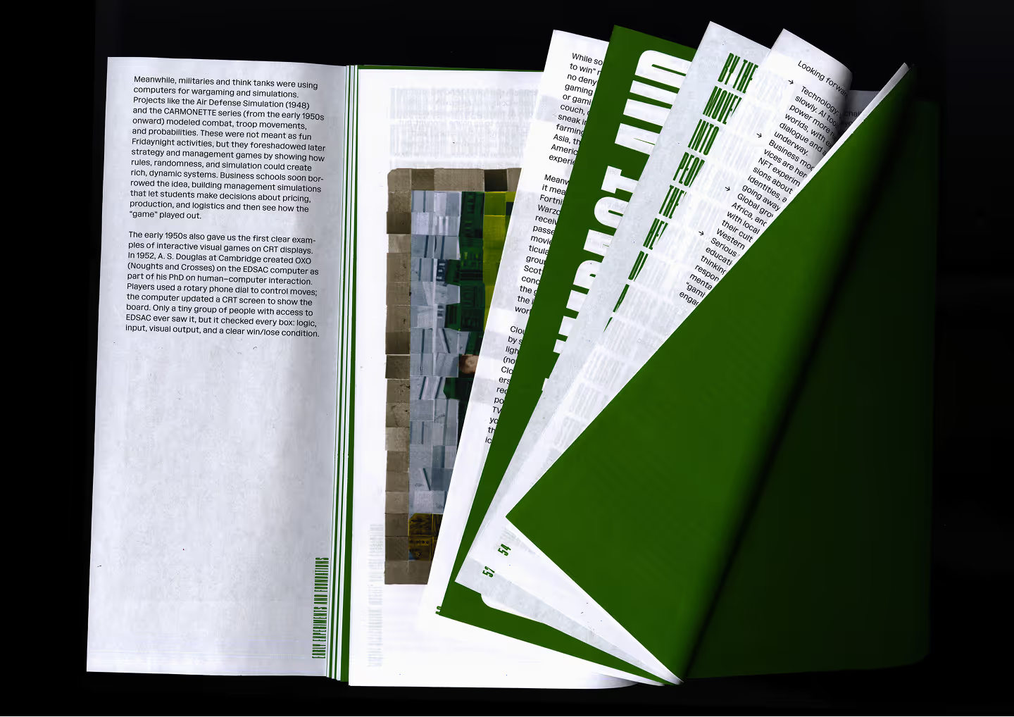
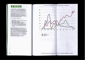
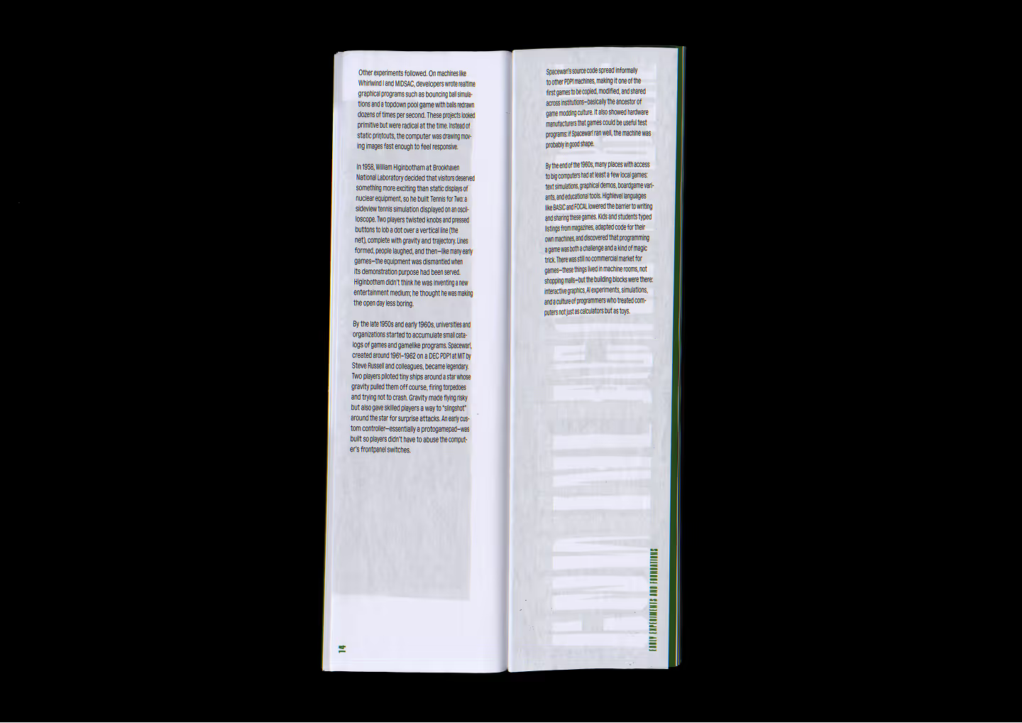
The choice of a thin paper reflects the idea of technological progression. When looking on the left pages, you can see the past elements and see how things were built on top of another. When looking on the right pages, you can see the future elements and start to feel curious on what will come next and how it will look.
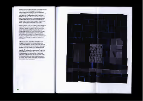
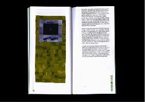
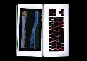
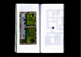
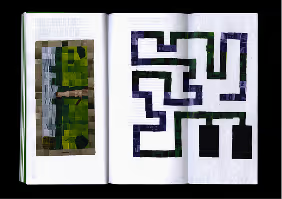
I created my visuals by printing an image of a device that already existed, cutting it into small squares, and assembling it to look like a different device. Transforming existing images into something different was a subtle way to show the similar way that those technologies advanced. It also shows how some technologies and techniques have stayed.
Ambiance
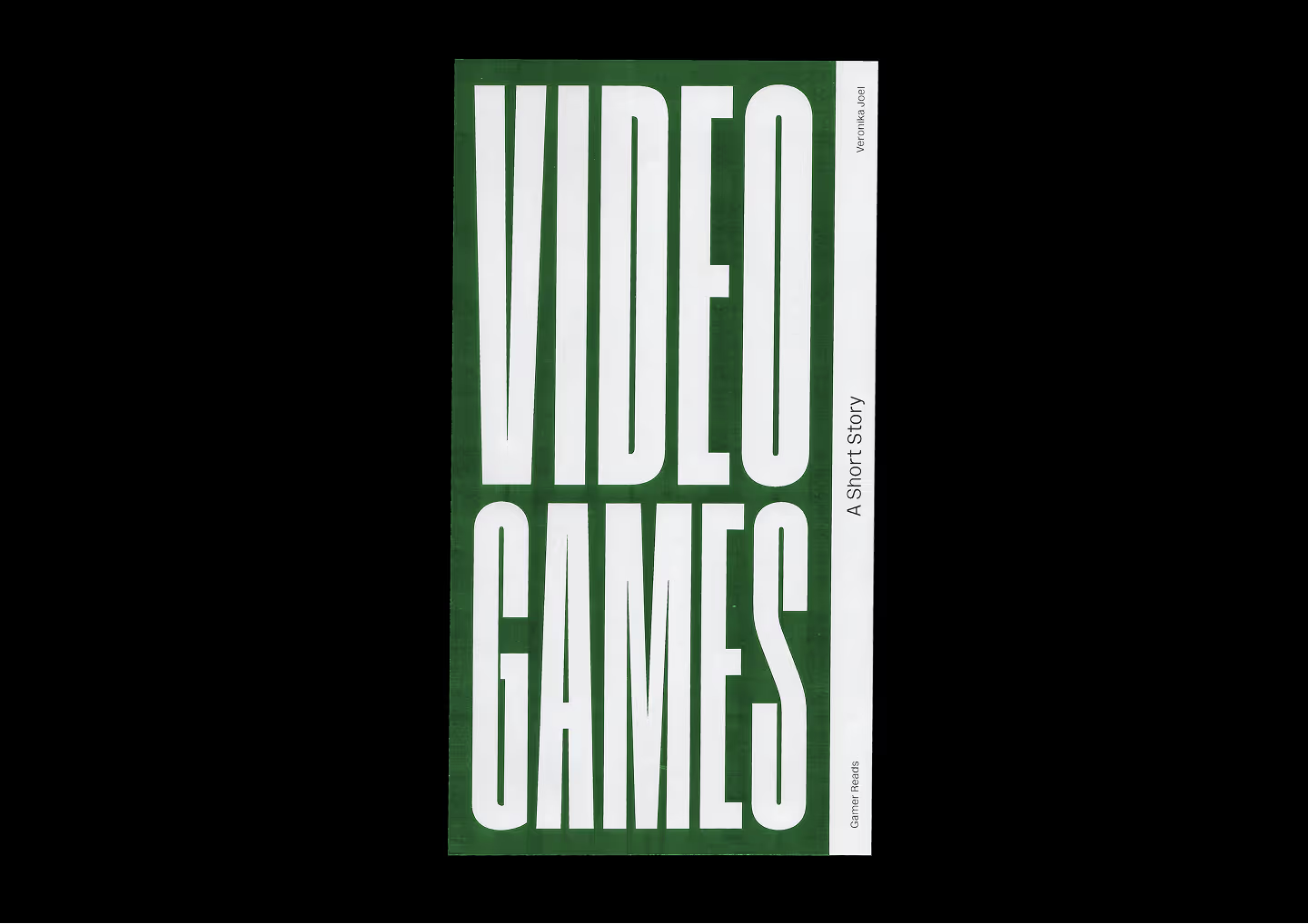
Video Games: A Short Story is a booklet on the chronological history of video games and their development over the decades.
Brief
I was tasked with designing an informative and descriptive layout that accompanies well the content. The booklet needed to be interesting to anyone curious about video games.
Concept
After reading the text provided, I started looking for themes that are consistent across the whole book. As someone who has some basic knowledge of video games, I asked my friends who know more about the topic to read the provided text. Having them read it helped me get a better understanding of the topic and find interesting information about the subject.
A theme we agreed to be interesting was the change in sizes of the video game devices and how the creation of new technology is done by building on top of things that already existed before. I incorporated those themes into my design through the visuals, layout composition, and choice of paper.
Design process
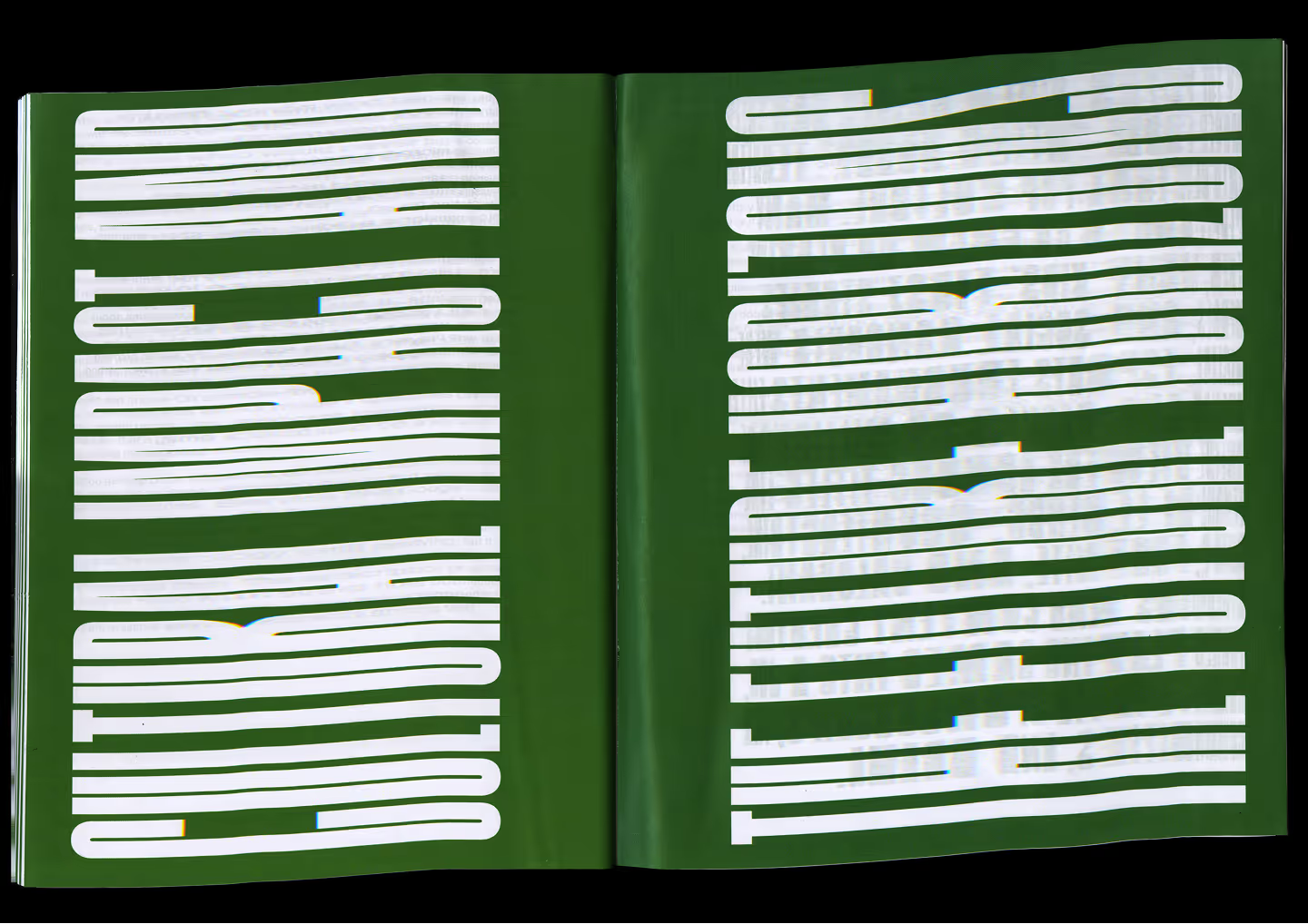
To present the decreasing size of devices in an interesting way, I decided to play around with typographic compositions to show how in the past they were very big and how now they are small enough to fit in our pockets. I wanted to use typography to create interesting visual texture in different parts of the layouts like the section openers and the first paragraph of each section.
Design process
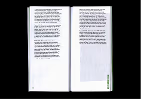
The choice of a thin paper reflects the idea of technological progression. When looking on the left pages, you can see the past elements and see how things were built on top of another. When looking on the right pages, you can see the future elements and start to feel curious on what will come next and how it will look.
Design process
The style of visuals I wanted to create would be made from collage. Because to create new technology you need to build on top of things that already exist, I found that using transformed images of gadgets to illustrate a bigger one would be an interesting way to convey that idea.

Design process
I created my visuals by printing an image of a device that already existed, cutting it into small squares, and assembling it to look like a different device. Transforming existing images into something different was a subtle way to show the similar way that those technologies advanced. It also shows how some technologies and techniques have stayed.
Credits
Typefaces
Gravity and Pelikan by Dinamo